DEVELOPMENT
Magazine Cover
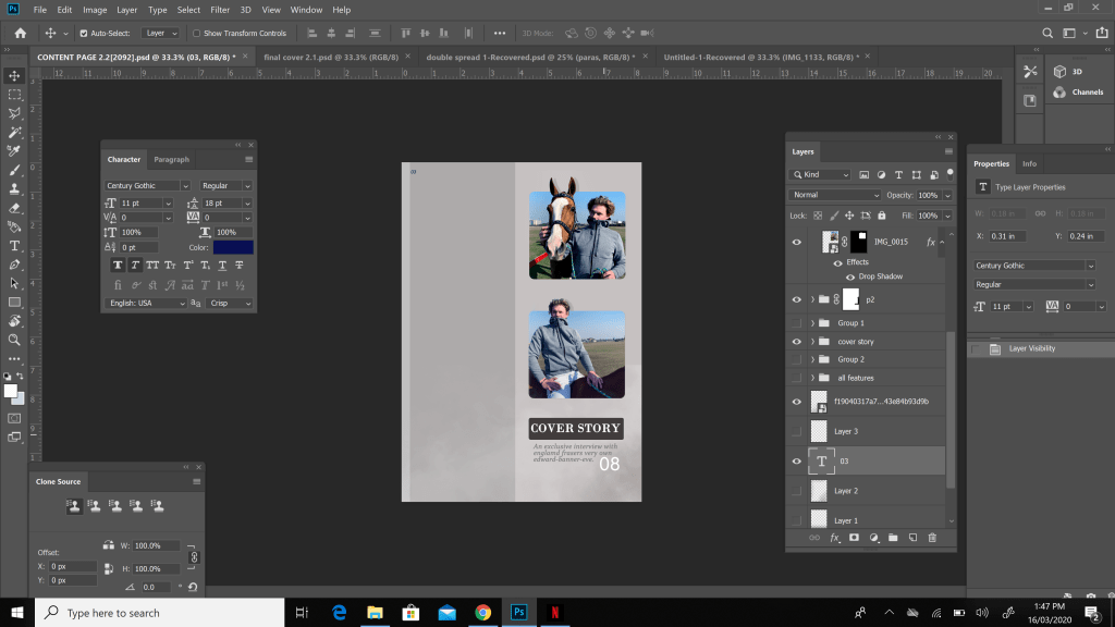
Finally after all my research and planning i decided to immediately start my final project and the first thing i decided to work on was my final magazine cover which was arguably the most important part of my project.
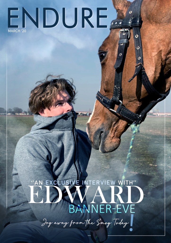
Before starting though i had to decide the title of my magazine and i wanted to name it something related to my topic on how air pollution affected athlete performance. After doing my research and planning and later giving out certain measures that could be taken in my magazine, one of the end results of it was that nothing much could’ve been done to finish air pollution so the athletes would have to play through it and only certain precautions would minimize it’s affects. After looking up many titles i decided to name my magazine ENDURE.

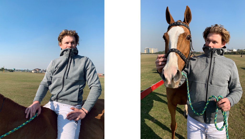
After deciding my title i chose a picture from my photoshoot which suited the description of an athlete not enjoying and hating the air. I wanted my model to seem natural yet have a concerned expression to his face to make the pollution seem really unpleasant. Furthermore the horse in my picture looks the model straight into the eyes to give of a look as if saying that it feels the burden too and this is why i believe my final cover picture turned out brilliantly.
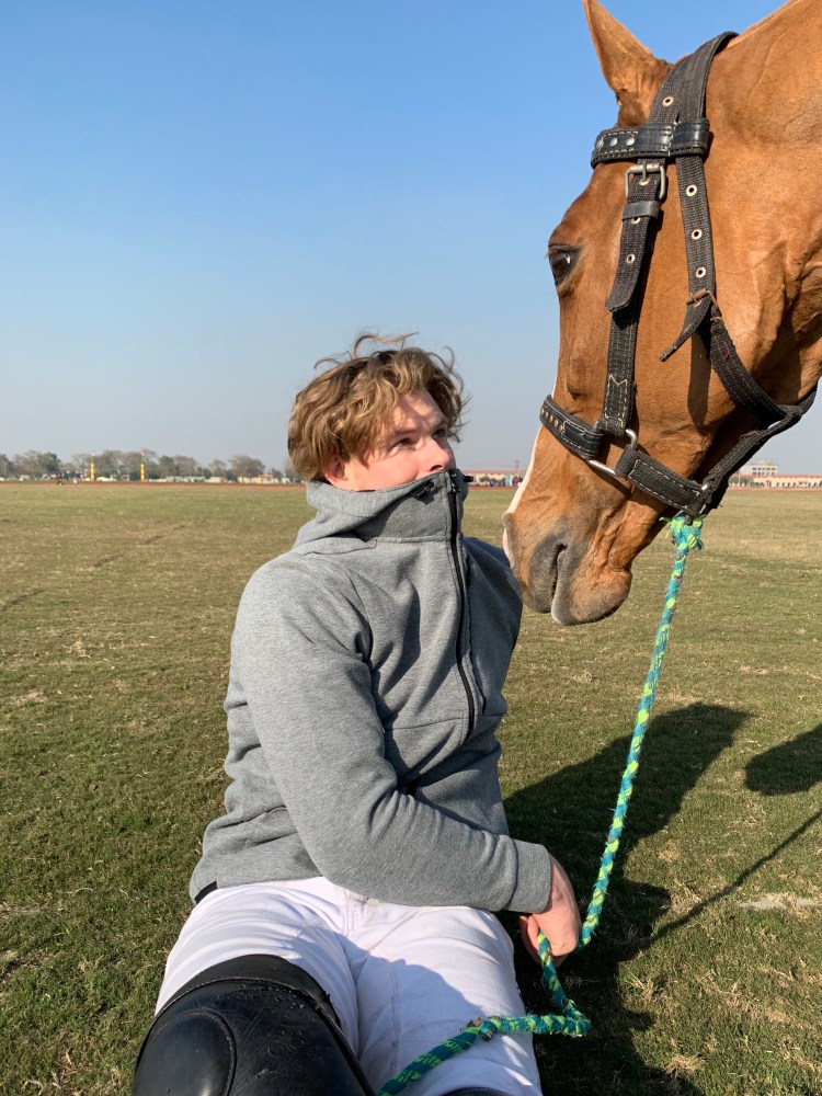
This picture wasn’t taken in extreme air pollution conditions and this is when i used my photoshop skills to add the vibe and environment while making it seem a bit over the top to give the impression of the pollution being a major issue and make the expressions of both my model and horse seem fitting and justified. I did this by searching up dark polluted clouds and fitting them onto my cover by lowering the opacity of the clouds to make it look like smog.

After this i decide to come up with a tagline which took quite a while but i ended up thinking of one which was athlete and air pollution related. I came up with the tagline “Jog away from the smog today.” I decided to write this tagline in Italic to make it seem really interesting at the bottom of the final cover while making it pop out at the same time.
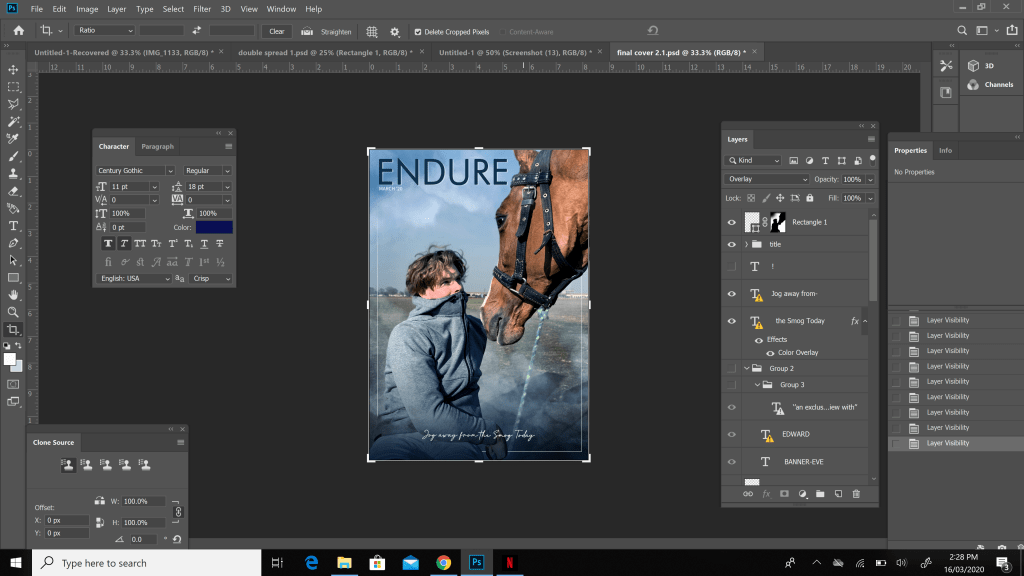
At this point i decided to keep my magazine extremely simplistic and letting the essence of the picture stand out and speak for itself. So to maintain this simplicity the only other detail i decided to add was to say that my magazine included an exclusive interview from Edward Banner Eve similar to my double spread as you will see below and i typed it in white to make it easily visible and prominent. Finally after adding this detail i was done with my magazine cover
Content Page
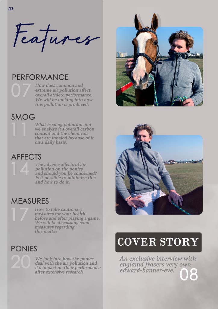
Since the beginning of my project i wanted to incorporate a completely grey theme in at least one of my projects. I believe this theme gives a very dark and gritty feel to the content page which fits the idea of polluted air perfectly and goes along with its general description. In addition to this i wanted the audience to be able to easily and comfortably read what my magazine had to offer, so grey content page is easy on the eye as well as extremely simplistic.
These were the pictures i decided to use in my content page and compared to both my double spread and final cover pictures the ones used in my content page were entirely different. In these my model is posing completely differently which is the major difference overall.
Before placing these photographs in photo shop i wanted to setup the backround for my contents page and decided to go with two shades of grey dividing my backround to further emphasize on my dark and air polluted incorporated theme which was also showcased in my mood board.

After finalizing my backround i then wanted to place my photographs onto it. To make these photographs more appealing and to make them pop out in my page i decided to dedicate the lighter half which is the right, light grey side of my backround to both my photographs and finally my main story as well. Two more details that i added were the ears of the horse to come out of the first photo and the head of my model Edward to make these photos even more appealing. I was able to perform these by making use of the mask tool and outlining the area of the photos to become a part of the backround.
Furthermore i wanted to add something unique and different to my content page aswell and decided to give titles to each feature which is very uncommon in sports magazines and magazines in general. I used five other features which i decided to name them as listed below.
- PERFORMANCE
- SMOG
- AFFECTS
- MEASURES
- PONIES
After deciding the titles and the page numbers i decided to stick with the grey theme for the titles but made my page numbers an extremely light shade of grey similar to white to make it pop out to the audience.

Finally i decided to add details for my titles and what the reader of my magazine would expect to read from each section of the magazine. I made these features a slightly lighter grey as compared to the titlles maintaining the overall dark and grey theme to the content page while at the same time making sure its easily visible. Furthermore i added a main Features title to the page and this was how i ended my contents page.
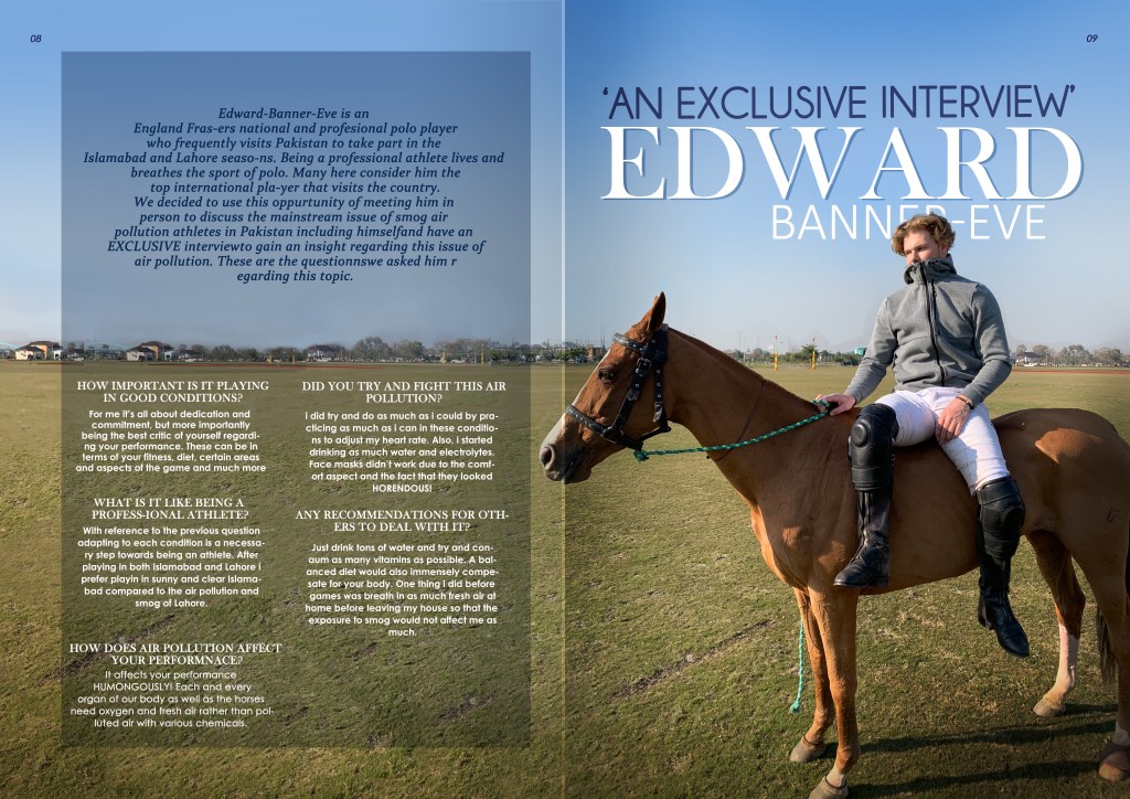
Double Spread
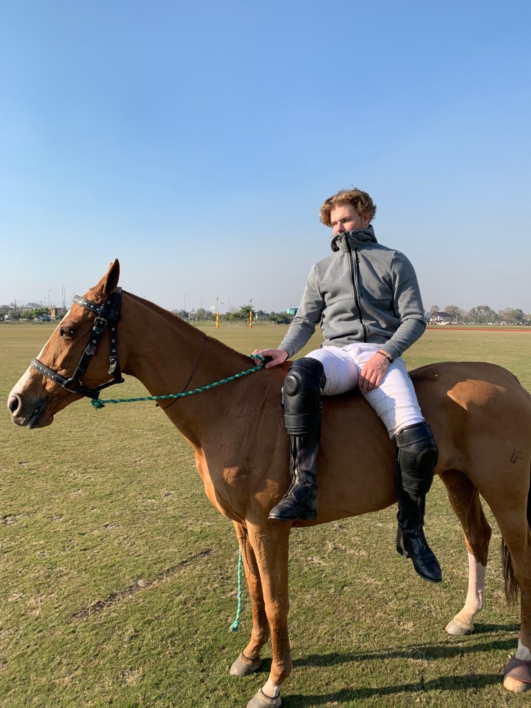
When deciding my final theme and overall project i already had a really clear idea as to how to go about my double spread. I had seen many pictures of people and players mounting the horses without any saddles or support. This really interested me and i tried pulling of a few of these stunts myself as they seemed fun.
As my model was more experienced and skilled than i am, i thought it would be a really creative and unique pose for my model. So i instructed him to sit on the horse without the saddle facing towards the camera without eye contact to make it seem like a candid and told him to act naturally and concerned to capture the best suited picture for my topic and double spread.
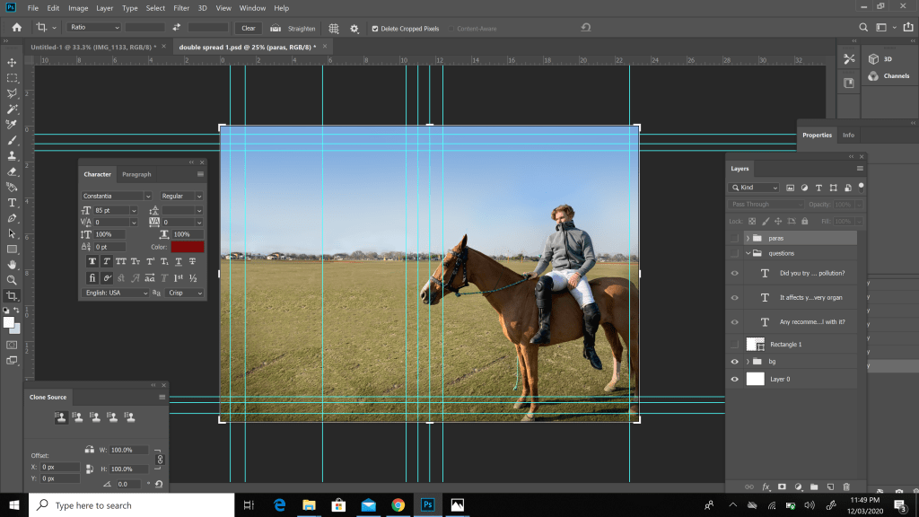
I wanted the entire picture to be used for my double spread rather than the much more common layout of half the page being a picture and half the page being the article/interview. But in order to do this i had to extend the landscape of my photograph through photoshop so that the photograph would fit the entirety of the layout. After countless attempts it was done.
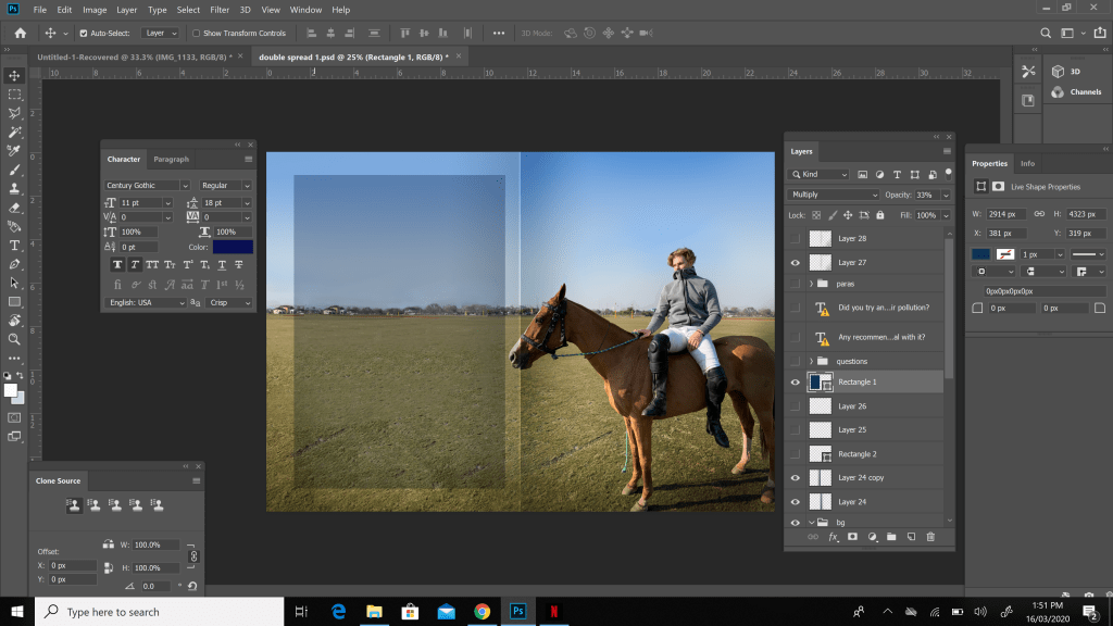
After this i wanted to make sure the air pollution/smog aspect was also incorporated into the double spread and was not left out. To do this i decided to place a low opacity black rectangle on the left side of my double spread on which i planned to place on my texts on. I did this so that the entire background was also visible along with the interview and introduction.
Finally it was time to write down my interview of my model Edward-Banner-Eve along with an introduction to him for the readers. The question in the interview i asked him were as listed below
- HOW IMPORTANT IS IT PLAYING IN GOOD CONDITIONS?
- WHAT IS IT LIKE BEING A PROFESSIONAL ATHLETE?
- HOW DOES AIR POLLUTION AFFECT YOUR PERFORMANCE?
- DID YOU TRY AND FIGHT THIS AIR POLLUTION?
- ANY RECOMMENDATIONS FOR OTHERS TO DEAL WITH IT?
I then wrote down the answers to each question of the interview and also wanted the questions and answers to be white and the introduction to be a popping dark blue so that it was easily visible and gave off a simplistic vibe.

Another thing i wanted to make sure my readers would know is that this interview was entirely exclusive to my magazine and i did this by boldly writing it behind my model along with his name. I made this dark blue due to the fact that my introduction also used dark blue and i used white for his name so that it seemed important and popped out. After doing this and some tiny little final touches i completed my double spread.
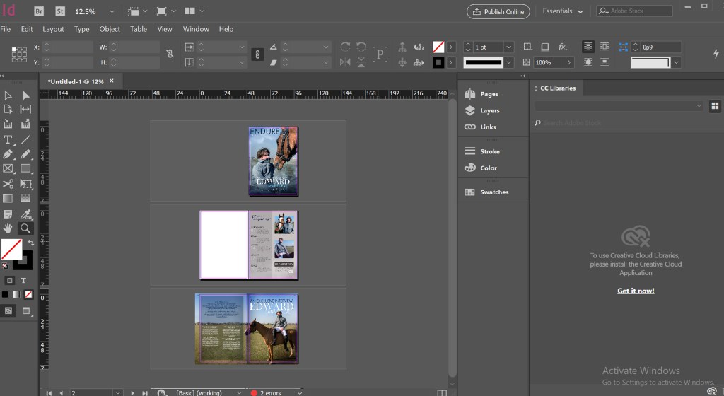
Lastly i adjusted the page numbers and the layout of the entire magazine in InDesign as shown below